ShopDreamUp AI ArtDreamUp
Deviation Actions

Private collection, please do not unlock
private drawings such as sketches, portraits and various handmade drawings. Due to the fact that it is not possible to hide folders, I decided to use this form of collecting my works
$100/month


Suggested Deviants


Suggested Collections


You Might Like…


Comments8
Join the community to add your comment. Already a deviant? Log In
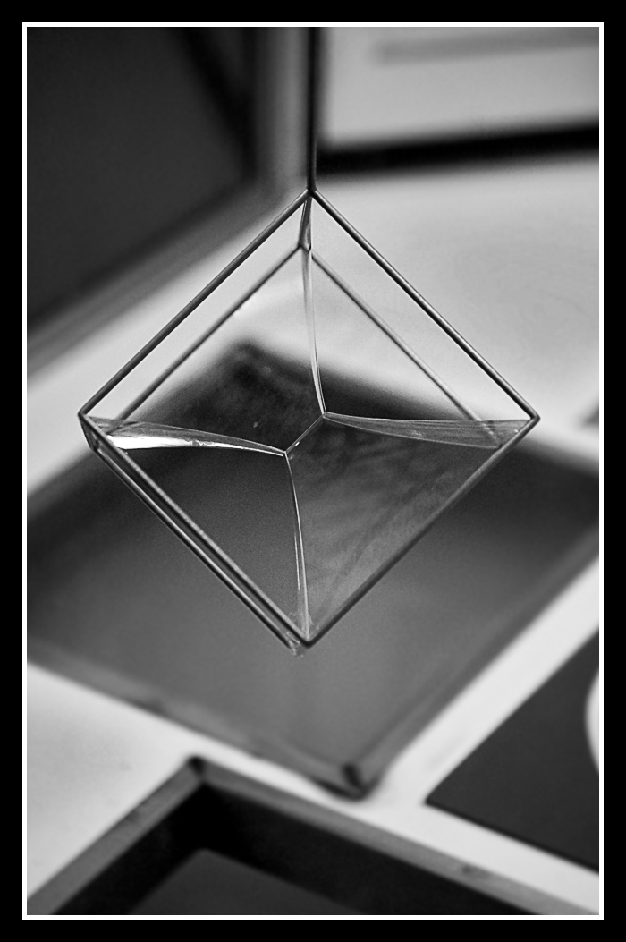
Certainly an abstract picture, something that most of us go 'ah, what the hell is that?'
But at the same time, it's also something, the same lot of us go 'ah, i really don't know what the hell that is, ah well.'
Aesthetically, yes, placing the subject in the middle might have worked quite well to an extent.
But the background seems to be less than desirable. We're not too sure about what those things in the background are and immediately, the eyes would drift away from the main focus and try to figure out what those blurred out things are in the background.
Sometimes, simple is good. Simple, plain background and yet captivating should be what you aim to look for.
As a comment goes as well, some contrast would be nice too, since this is already almost blending in with the background. So we can see more black turn black and white turn white. Because a greyish picture might look rather untidy and messy.
Well as a tip to go for this picture and to take-away for future shots, always as yourself: What would be aesthetically pleasing to the eye? And also ask yourself: Does it look nice to me? Because in every shot, the author has to love it and be able to express it in his best way to sometimes persuade his watchers to love it in that same perception too!
Keep working on it <img src="e.deviantart.com/emoticons/s/s…" width="15" height="15" alt="